Table of Contents
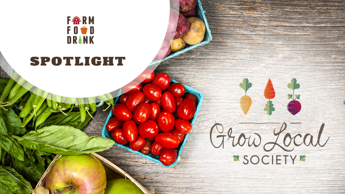
Have you heard of the Grow Local Society in the Coquitlam area? It all began 25 years ago as the Coquitlam Farmers Market, and since then has expanded with good work in developing community gardens, food security projects, plus another market, the successful Port Moody Farmers Market. The Grow Local Society (Grow Local) mandate is to educate about the importance of local food, supporting local farmers and food producers, and looking at how to build a resilient food system through community involvement.
Over time and with each new initiative, a branding challenge developed. How could they reduce confusion and better inform the community on how these impactful Society initiatives and farmers markets are all connected and power each other. With a lack of brand consistency, the ultra important food initiatives they led were unclear, the cost and effectiveness of promotions were unstable, and it complicated grant applications for the society.
The Project
In 2018, the Grow Local Society went through a process to redefine their organization and came up with their current name and logo so that it better represented the work they were doing. This year’s 25th anniversary of the Coquitlam Farmers Market drove the desire to formalize an umbrella brand for the Society that would incorporate the two farmers markets and other initiatives they lead. This project would include refreshing the markets’ old logos so they would be recognizable as being part of Grow Local, yet having their own distinction.
The Creative
It was important for the client that no matter what project or event occurred that the brand be consistent and always tied back to the Grow Local Society. With so many pieces in this growing organization, it was also important to have a Brand Guideline created to support that consistency. Here is how the project evolved.
Grow Local Logo
The Grow Local logo had many positive aspects including that it correctly symbolized local food and farms with its vegetable icons and hand-drawn typeface. With a tight budget, it was deemed better to improve upon the existing logo and put more budget towards a rebrand for the farmers market identities.
What was done:
- Adjusted the handwritten font spacing between letters and inconsistencies
- Enhanced some colours to be richer for better legibility
- Enlarged the word “SOCIETY” to work in smaller formats
- Tweaked some inconsistencies to simplify the logo

Farmers Market Logos
To start with, the farmers market logos were dated and needed a fresh update and look. As a primary objective of the project, it was important to build a strong connection with the Grow Local Society through visuals. This was accomplished while still showing a distinction for each markets brand. The resulting creative demonstrated the farmers markets are progressive yet still embracing traditional, wholesome food values.
What was done:
- Pulled through vegetable icons from the Grow Local logo
- Continued with the coinciding colour pallet from the Grow Local logo
- Developed a cleaner, more modern look with hints of retro elements

25th Anniversary Logo
Instead of creating a one-time logo for the Coquitlam Farmers Market to honour their 25th anniversary, it was decided to do something a bit different. As above, we developed a new market logo for long term use. To commemorate the 25th, we created a stand-alone logo that could be added to images as a sort of flag or banner on different marketing elements.


Brand Guidelines
As a small non-profit, there is inevitably a large staff turnover. The Brand Guideline allows for new staff to have something to guide them as they create marketing materials so there is a professional and consistent look and avoids creating further brand confusion.
Social Media
To get their new brands visible, we created header images for their social media accounts, and some post templates to stylize their social media activity.
Shopping Bags
To show off the logos at the Coquitlam and Port Moody Farmers Markets, new tote bags were created to launch the new look.


Poster Design
Although outside of the original project scope, this was an opportunity to actively show how the new brand elements could be used in a fun and lively way to showcase the positive personality of Grow Logo and its farmers market family.


Website Concept
We mocked up a website home page to show how they could incorporate the new brand consistency of this project into a new website. That will be their next big marketing initiative…after farmers market season.

The Result
Back to the original objective to eliminate brand confusion, feedback from customers and vendors has been great. They love the new look of the logos and the energy they evoke. People can now make the logical connection back to Grow Local.
The resulting consistent look has made it much easier for Society staff to use the new brand elements for all their marketing. They’ve updated their market signage, redid their tents, distributed the posters, and are just waiting for the new branding on their van. An exciting start!
Client Reaction
Grow Local Society’s Executive Director, Tabitha McLoughlin had previously worked with Farm Food Drink on past projects with the British Columbia Association of Farmers Markets. She knew they understood the farmers market business, their background, how they’re organized, how they represent, and how they’re run.
To really professionalize the Grow Local name and brand, it was important to Tabitha and her Board to work with someone who was already familiar with that space, so Farm Food Drink was a natural fit for the project.
“The Farm Food Drink team was very responsive, helpful, and reassuring,” explains Tabitha. “They were very good at making concepts understandable to achieve what WE wanted to achieve.”
The project had lots of potential for scope creep, but we were able to keep things tight to what the original objective and plan were, while still being super accommodating to the client and their budget.
Has your logo and brand seen better days? Or maybe you’re celebrating a time when a new image is required. Contact us to explore your possibilities.
If you’re a good person doing good things with food, we want to hear from you!
Do you have a story to share or a project you’re interested in?
Get In Touch
